
The LGL dashboard
In this article:
- The LGL dashboard: A portal into your data
- Customize the dashboard
- Summary reports on the dashboard
- Printing options for the dashboard
The LGL dashboard: A portal into your data
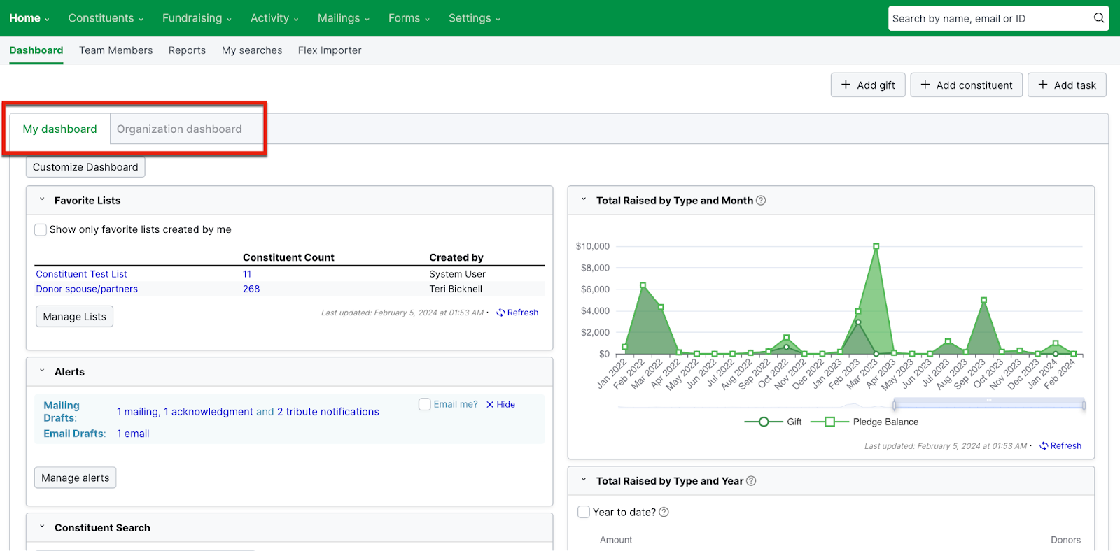
When you first log into LGL, you'll see the LGL dashboard, available in two views: “My dashboard” and the “Organization dashboard”.
These views are a gateway to your Little Green Light account, and (depending on your permission level) they allow you to see your data in cross sections and at a glance.
The dashboard is a flexible tool. You can customize, move around, and resize the widgets you select to place on it to make it work best for your purposes.
Two dashboard views
The widgets on the dashboard pull data in from your account in various ways, letting you view it at a glance. Two views of the LGL dashboard are available, each in its own tab: The “My dashboard” view and the “Organization dashboard” view.
My dashboard
Each user in LGL can configure their own personal (“My”) dashboard to display the widgets they want and to arrange them as they’d like. The following widgets are available in “My dashboard”:
- Visualize your gift and pledge data in graphical charts and tables
- Track alerts, such as gift acknowledgments that need to be sent
- View upcoming tasks and activities on your calendar
- See open goals and tasks
- Check who your 10 most recent donors are or look up a constituent by name
- And much more
For example, a membership manager might place the “Membership Summary” widget at the top of their personal dashboard, whereas the volunteer coordinator would be likely to place the “Volunteering Hours” widget at the top of their dashboard.
This video explains how the "My dashboard" view works:
Organization dashboard
The Organization dashboard operates differently. It will always appear the same to everyone who has access to view it ( NOTE: Team members who are assigned the Volunteer role do not have access). The Organization dashboard can also be configured only by an Administrator. The Organization dashboard is intended to help everyone in your organization stay on the same page in terms of data because everyone is looking at the same organization-specific data.
The same widgets are available for both views of the dashboard, with one exception: The My Constituents, Goals & Tasks widget is available only on “My” dashboard because it’s unique to each team member.
Customize your dashboard
You can customize the layout and placement of your dashboard widgets, resize them (depending on how much data is displayed in each), and drag and drop them into the left, middle, or right column of the page to customize your view.

NOTE: Your "My dashboard" view is specific to your user login, so customizing your personal dashboard will not affect what other team members in your account see in their "My dashboard" view.


The available widgets for the "My dashboard" and "Organization dashboard" views are outlined in red in the screenshots above. If you select the checkbox next to any of these options, it will be added to the top right position on the dashboard view you're selecting it for.
NOTE: The widget type is indicated by the icon next to it. The spreadsheet icon indicates that the widget is a table; the chart and graph icons indicate that the data in the widget will be represented visually using a chart or graph.
Moving widgets around to personalize your view
You can position your dashboard widgets to tailor what you see when you view your dashboard. Whenever you “edit” your dashboard options in Customize mode, you'll be able to add widgets and you'll be able to move them by clicking and dragging one at a time. This means you have the ability to resize and rearrange them into one, two, or three columns (depending on the size capacity of each widget).

All widgets have their own minimum width, so you can widen any of them to fit (depending on the amount of data the widget is displaying) and position them according to your preference.
To move a widget, click the Customize Dashboard button on your dashboard. Then drag the widget and drop it in the new location.
NOTE: You may need to drag a widget and drop it a number of times to move it a large distance—from the bottom of your dashboard to the top, for example.
To resize a widget, click and drag the caret in the lower right corner to a larger or smaller size:

Remember to click the Save button anytime you make changes to your dashboard that you want to keep.
Summary reports on your dashboard
Graphic or chart widgets
Your dashboard includes a number of summary reports. A number of these are available as graphs or charts that enable you to visualize your giving data:
- Total Raised by Month, Year over Year
- Total Raised by Type and Year
- Total Raised by Type and Month
- Pledge Summary by Year of Pledge
A screenshot of each of these graphic-based widgets and a description of the data each displays and how it works are included below.
NOTE: It is not possible to customize any of these widgets beyond what the buttons available in each allow.
Total Raised by Month, Year over Year

This widget compares the sum of gifts and pledge balance by month for the current year and prior two years.
Total Raised by Type and Year

The total giving for each year is broken out by gift and pledge balance as well as the donor total for each year. You can remove giving types by clicking on the series name ( Gift, Pledge Balance, or Donor Count) at the bottom of the chart.
TIP: Total Raised by Type and Year with Donor Count is a great chart to give to your board of trustees every month.
Total Raised by Type and Month

This widget displays total giving for each month, broken out by gift and pledge balance. You can scroll the slider underneath the chart back and forth to change the time period reflected, making it shorter or as long as up to five years ago. To move the slider, grab one or the other end and drag it.
Click on either the Gift or Pledge Balance series name to add or remove one or the other type of data to or from the chart.
Pledge Summary by Year of Pledge

The Pledge Summary by Year of Pledge widget can be viewed as either a table or a chart. To change the widget to a table, click the Switch to Table button.
This widget includes the amount pledged by year broken out by pledge balance. You can use the toggle on the top left filter to view all pledges, only open pledges, or only closed pledges.
NOTE: Only gift and pledge data are presented in the graph and chart dashboard widgets.
Additional widgets
Other dashboard widgets are described in this section.
The Fundraising Totals widget shows totals for the last three fiscal years by Giving, In Kind, Other Income, Pledges, and Installments. You can toggle between a view by fiscal year or by month, and you have the option to view the data year to date as well:

Alerts notify you of items you may need to tend to, such as LGL Forms submissions to review, gifts that need to be acknowledged, and possible duplicate records.

By going to the My Profile area in LGL, administrator-level users can manage which alerts appear on the dashboard and which will send email notifications.

NOTE: "Recaptured" donors are those who made a gift this fiscal year and at some point in the past, but did not donate in the previous fiscal year.

The My Constituents, Goals & Tasks widget shows the number of constituents you are stewarding as well as your open goals and tasks. You can click on any item in blue to be taken to a list of search results containing them:

The Calendar displays activities occurring by day, such as gifts received, installments that are due, tasks that are due, and events. You can filter the calendar to show activities "owned" by team member.

Activity allows you to quickly view the week's activity (gifts, mailings, tasks, goals, contact reports, etc.)

Donor Summary by Year gives you a snapshot of your first-time donors, consecutive-year donors, and recaptured donors (donors who made a gift this fiscal year and at some point in the past but did not donate in the previous fiscal year). You can also toggle to previous gift years and view the data year to date. Click on the numbers of donors in blue to see the list of constituents, in addition to the criteria that are used to generate the constituent search results.

The Goals Summary section displays open goals that can be readily viewed.

Campaigns, Funds, Appeals, and Events list your campaigns, funds, appeals, and events with the most recent gifts attributed to them:

Volunteering Hours displays the number of volunteer hours recorded for the current year and the current month:

Constituent Search allows you to conveniently search for a particular constituent and also lists the constituents who gave the 10 most recent gifts.

The Stewardship widget is a handy way to keep track of your donors, as it displays the number of Top 100 donors who have not yet made a gift this fiscal year, LYBUNTs (all donors who gave last year but unfortunately not this year), and more. Click on the numbers in blue to view the donors who fall into these categories. You can adjust your view by selecting a particular steward from the dropdown menu.

If you've turned on membership settings in your account, you'll also have the option to include the Membership Summary widget:

The pledge summary widget provides you with information about your pledges:

The "Favorite Lists" widget displays the top 5 lists that the user has favorited. The widget links to the List page, the List detail page, and the search results for the List itself. It can be found by customizing the dashboard and is not active by default:

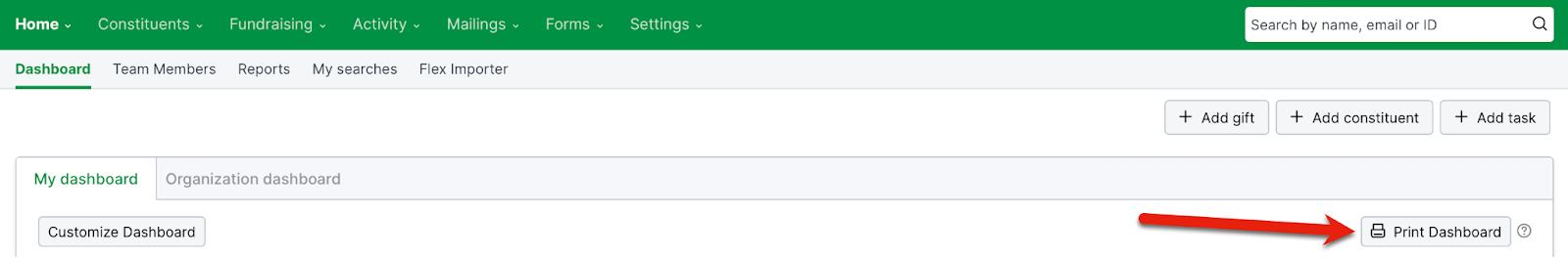
Printing options for the dashboard
Two printing options are available from the LGL dashboard, which apply to both “My” dashboard and the “Organization” dashboard: Printing the entire dashboard and printing individual dashboard widgets.
Print the entire dashboard
Printing the dashboard is useful for creating data reports that you can easily print or share electronically with others in your organization. On the Organization dashboard, this can be especially useful given that you can print an organization-wide data report for a Board of Trustees or other entity.
To print the dashboard, either from your My dashboard or Organization dashboard view, click the Print Dashboard button, as shown here:
Below is an example of an Organization dashboard printed to PDF that you might bring to a board meeting. This example shows 5 among the 20 widgets that are available.
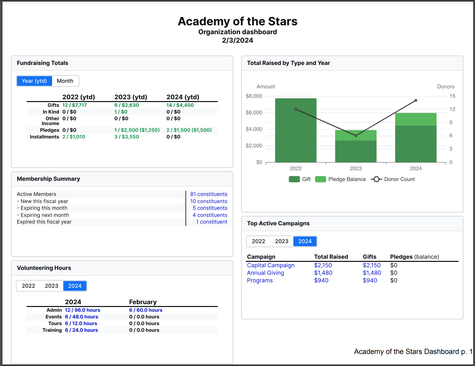
NOTE: Selectors such as the Calendar, fiscal year toggle, YTD button, or timeframe slider will not be printed, nor will the “Minimize” arrow that is available within some widgets on the dashboard.
Print individual dashboard widgets
Any individual dashboard widget can be printed in either JPEG or PNG format. This allows you to grab images of individual widgets and incorporate them into documents or emails. This feature is available on both the personalizable “My” dashboard and the “Organization” dashboard.
To print any individual widget from the dashboard, click its “Download” icon, as shown here:
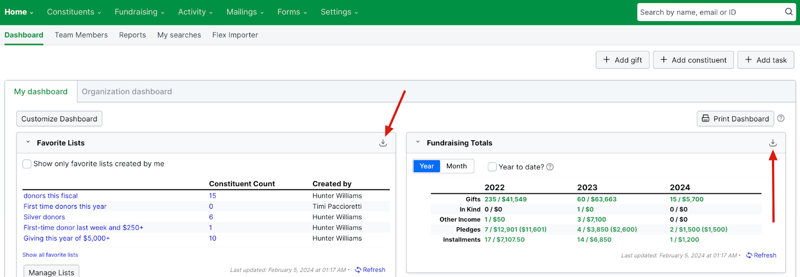
NOTE: Selectors such as the calendar/FY toggle, the YTD button, and the timeframe slider, as well as the “Minimize” arrow, are not included in the downloaded images.